Logos by Lara Maville Design
Logos by Lara Maville Design

Logo design is a multi-faceted process. It is the art of taking an overall company philosophy and manipulating it until it fits into a creative, recognizable, memorable symbol. That symbol not only represents a client and their business—it also represents my company, and that is how I approach every logo I design.
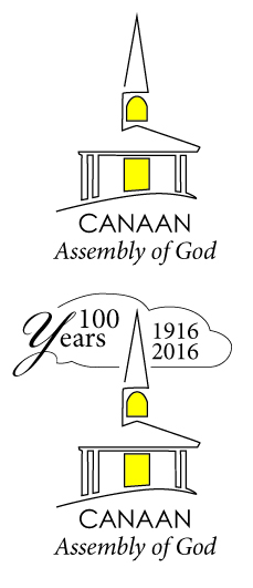
One of my recent logo projects was to design a new logo for an old church. The Canaan Assembly of God in Canaan, New Hampshire had never had a logo before, and 2016 will mark their 100th anniversary. Working with the pastor of the church I designed a logo that will be their standard logo on letterhead, business cards, etc. Then I modified it to create a 100 Year version that will be used on a limited basis. The logo will be used on their website which I will also be designing – stay tuned!
The challenge of this logo was to create a look that was representative of a place of worship without being in-your-face religious. I chose to go with a simple rendering of the building using one continuous line, and added the touches of light from within.
I wanted the font treatment to be linear to match the artwork but also quiet and respectful, as when one is in a church.
My design process involves sketches, research, and reaching into my experience as far back as my art college days. I always hear my design teacher at Montserrat saying “Type is not an afterthought” when working on logos. Once a few ideas have taken form I modify them and look at how they could be improved. Could it have a subtle twist? How will it be seen by others? How will it be reproduced?
All of these forces coming together are part of what I love about being a designer. The other part is getting to see the final logos all over the community in one form or another. And every time I do, I'm seeing a logo for Lara Maville Design. It better be good.
