Designing a logo is a multi-faceted process. It is the art of taking an overall company philosophy and manipulating it until it fits into a creative, recognizable, memorable symbol. That symbol not only represents a client and their business—it also represents my company, and that is how I approach every logo I design.
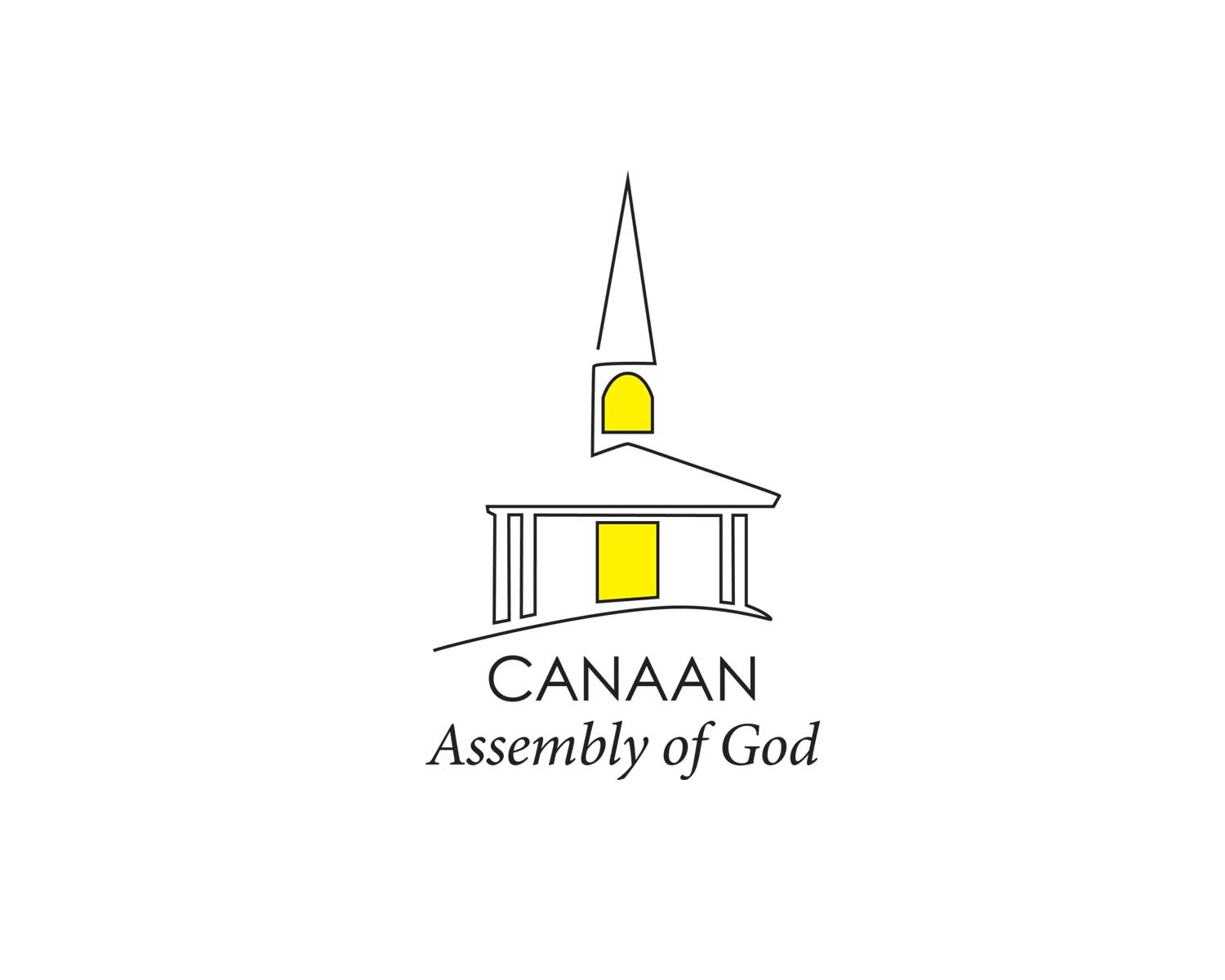
One of my logo projects from a few years back was to design a new logo for an old church. The Canaan Assembly of God in Canaan, New Hampshire had never had a logo before, and 2016 would mark their 100th anniversary. Working with the pastor of the church I designed a logo that will be their standard logo on letterhead, business cards, etc. Then I modified it to create a 100 Year version that was to be used on a limited basis.
The challenge of this logo was to create a look that was representative of a place of worship without being too religious. I chose to go with a simple rendering of the building using one continuous line, and added the touches of light from within. My design process involves sketches, research, and reaching into my many years of experience.
I wanted the font treatment to be linear to match the artwork but also quiet and respectful, as when one is in a church. As a design student at Montserrat I learned “type is not an afterthought” so I try to work on both the logo mark and the type simultaneously. Once a few ideas have taken form I modify them and look at how they could be improved. Could it have a subtle twist? How will it be seen by others? How will it be reproduced?
All of these forces coming together are part of what I love about being a designer. The other part is getting to see the final logos out there in the community in one form or another. And every time I do, I’m seeing a logo for Lara Maville Design. It better be good.

